Hello there, fellow art enthusiasts and connoisseurs! If you’re here to learn about packaging artwork properly, you’ve landed on the right page. Let’s unravel the mystery of packaging artwork together.
What is Packaging Artwork?
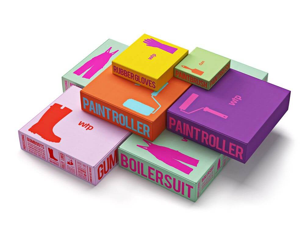
Packaging artwork is akin to conducting a symphony between aesthetics and functionality. It’s a meticulous process that involves crafting a package that not only serves as a protective shield for your treasured art pieces during transit but also acts as a spotlight, highlighting them in the most visually arresting manner. This procedure encompasses everything from the careful selection of the right safeguarding materials for the artwork to infusing unique design elements that set your package apart from the rest.
Packaging Artwork: Comprehensive Guidelines for Artwork on Packaging
Packaging is a critical aspect of product marketing that is often overlooked. A well-designed packaging box not only protects your product but also communicates your brand message effectively. However, achieving this requires adherence to certain artwork guidelines for packaging. Here, Elixir Packaging provide a comprehensive guide to help you understand these guidelines.
Lines and Dielines
Dielines are the flat templates for your package design. They define where the package will be cut and folded. Hence, it’s crucial to ensure that all lines and dielines are correctly placed and accurately represent the final look of the package.
File Format
The file format plays a significant role in ensuring the quality of your artwork. For best results, use vector files like AI, EPS or PDF formats. These formats preserve the quality of your artwork, allowing them to be scaled without losing their resolution.
Placed Images
Images used in your packaging design should be high-quality and relevant. They should enhance the overall look and feel of the packaging, while also conveying the right message about the product inside.
Color Details
Colors play a vital role in packaging design. They can influence the buyer’s emotions and perceptions about the product. Therefore, it’s important to use colors strategically and ensure they match your brand identity. Also, consider how different colors will look when printed.
Graphic Resolution
High-resolution graphics are essential for clear, sharp images on your packaging. A minimum of 300 dpi is recommended for print designs to ensure your packaging looks professional and appealing.
Outline the Fonts
Outlining your fonts ensures that they remain consistent across different platforms and software. This helps maintain the integrity of your design, especially when your files are opened on different computers.
Cut Off/Bleed
Bleed is the area of your design that goes beyond the trim edge. It’s essential to include a bleed to ensure there are no white edges in the final print. The standard bleed size is typically 1/8 inch.
Barcodes
Barcodes are an essential element of packaging design. They should be clearly visible and easy to scan. Place them in a location that doesn’t interfere with the overall design and aesthetics of the package.
Placement
Placement of elements such as logos, text, and images can greatly impact the visual appeal and effectiveness of your packaging. Aim for a balanced and cohesive design that guides the eye through the package.
Look for Spelling Errors
Proofreading your packaging design for spelling errors is a must. Any error can damage your brand’s reputation and make your product appear unprofessional.
Clarity
Ensure that your packaging design is clear and easy to understand. Your product name, brand, and key features should be easily visible and readable.
White Ink
White ink can add a unique touch to your packaging design. However, it’s important to note that white ink might look different on different materials and under different lighting conditions.
Overprinting
Overprinting is when one ink color is printed on top of another. It can create interesting visual effects, but it needs to be handled carefully to avoid any unexpected results.
In conclusion, adhering to these packaging artwork guidelines can help you create a compelling and effective package design. Remember, your packaging is an extension of your brand, and therefore, it should reflect your brand’s values and aesthetics.